

With the logo covered, could anyone still tell that it was you?
What makes a brand recognisable is rarely the mark. It is the colour someone half-remembers, the shape of the packaging on a shelf, the way a photograph is cropped. Those are decisions, and most businesses never make them deliberately.
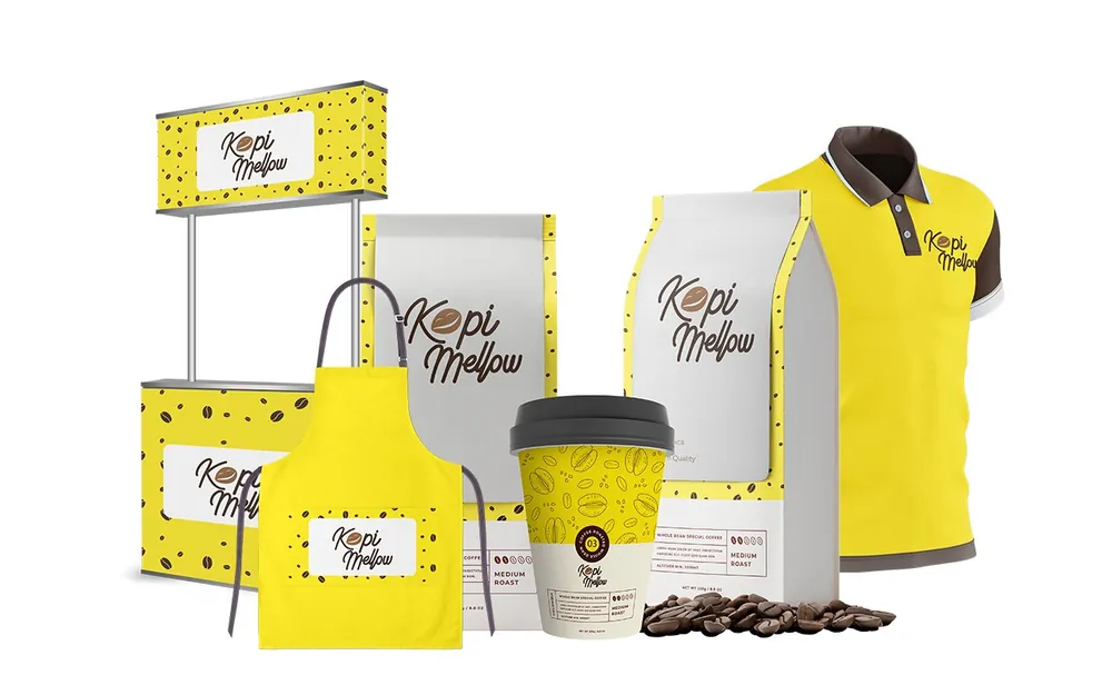
We build the whole visual vocabulary — mark, palette, type, imagery and layout — and then the rules that keep it intact when twenty different people are using it.
What you receive
01
Logo system
Primary mark, stacked and horizontal variants, an icon-only version, and clear rules for minimum size and spacing.
02
Colour
A palette with defined roles, not just swatches — which colour leads, which supports, and what never sits next to what.
03
Typography
A heading and body pairing with a real scale, licensed for the platforms you actually publish on.
04
Imagery direction
How photographs are shot, cropped and treated, so a new photographer can match the existing library.
05
Layout principles
Grid, margins and composition rules that make an unfamiliar layout still look like you.
06
Asset library
Exported files in every format your team and your printers will ask for, organised so nobody has to email us for them.


Beyond Brand Visuals
This works harder alongside
Elsewhere in Branding
